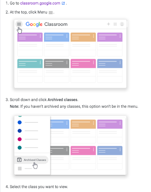
|
| Here are the current logos for 4 Calgary agencies. |

 We then got to choose one of the four organizations to design a logo for. We used graph paper so that we could easily make our logos symmetrical, as well as use polygons in our design. Then, we counted the total area of our logos, so there was lots of Math used in the making of these!
We also coloured ours and described how our designs and colours used represented the social agency. We'll share this work with you at our next Student Learning Conferences (date to be announced).